How a World Map Is Made
Automatic Translation by ChatGPT
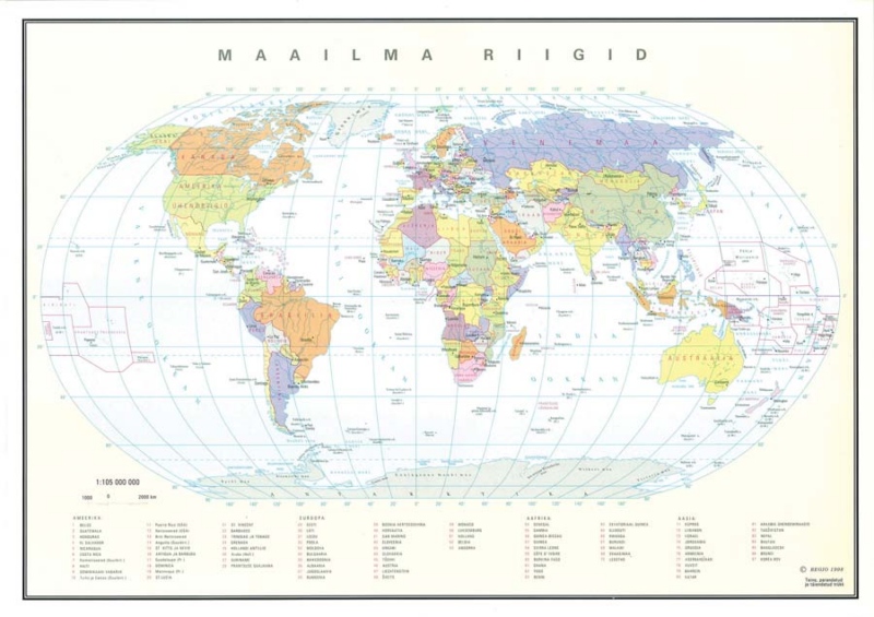
The first political world map produced by Regio was published back in 1993, at that time in A3 format. Over the years, this map—later also available as a wall map—has kept a fairly consistent visual style. However, we have continuously and significantly updated its content, even though it might seem like there haven’t been many changes—after all, the countries are mostly the same, right?
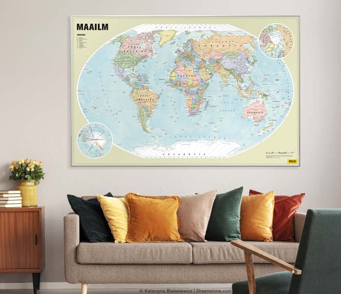
This year, we undertook a thorough update of our oldest wall map and added shaded relief to enhance the visual depth. Now, the newly updated map has gone to print, and anyone interested can get a copy for themselves.
Regio editor and proofreader Kertu Uibo writes below about the challenges a cartographer faces when creating a political map of the world.
How to Represent Politically Complex Areas on a Map
Creating a political world map seems like a straightforward task—you simply mark each country, its name, and its capital. Color the countries in different shades, and voilà: a beautiful political map is ready. There are plenty of examples to follow as a guide.
But once this seemingly simple task is done, it quickly becomes clear that the entire map isn’t quite complete. In some places, it’s not even clear where exactly to draw the border, and here and there are grey areas that are hard to color at all.
For the cartographer, this presents quite a conundrum: how to depict politically ambiguous situations on a political map—especially on an overview map, where there’s no room to explain every exception and nuance.
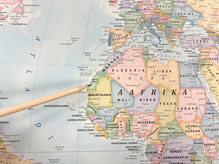
In our new map, we resolved this by using a different line style for disputed borders. Contested territories are shown with hatching, where the color of the controlling country is marked with a broader stripe. Some areas, however, remain ambiguous—how, for example, should one depict Palestine or Western Sahara?
How we solved that can now be seen on the new map itself.
Does the Netherlands Have One or Two Capitals?
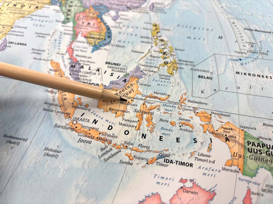
Even country capitals present challenges for mapmakers. For instance, Kazakhstan periodically changes the name of its capital. Indonesia is building a new capital to replace Jakarta—called Nusantara—but it’s still unclear when it will officially become the capital. Egypt is also constructing a new capital and is further along than Indonesia, but there’s a different issue: the new city doesn’t yet have a name. And without a name, we can’t put it on the map.
There’s talk of new capitals in South Korea, Malaysia, and Equatorial Guinea as well. Some countries have not just one capital but two, even three—or their capital’s status is ambiguous altogether.
While creating the map, we found ourselves wondering: Does the Netherlands have one or two capitals? And what is the capital of Israel?
The Agreed-Upon Line Where the Date Changes
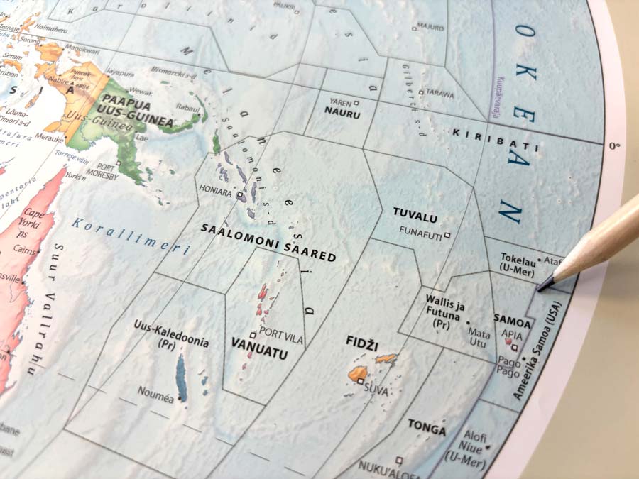
Our newly updated world wall map includes some exciting additions. For example, behind the political information, there is now a shaded relief layer, which adds visual interest and makes it easier to explore settlement patterns and the location of islands in the seas. A new feature on our map is the International Date Line. Now you can see why two island nations—Samoa and American Samoa, located just 70 kilometers apart—have different dates: the International Date Line, an agreed-upon boundary where the date changes, runs between them.
How to Map Countries’ Territorial Claims?
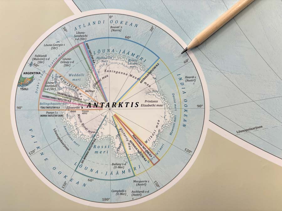
As a bonus, our world map includes separate smaller maps of the Arctic and Antarctica, providing a clearer understanding of their location and shape. On the Antarctica map, countries’ territorial claims are shown as part of the political information. These claims are currently indefinitely frozen, and the continent is considered politically neutral.
And to Finish, One More Interesting Fact:
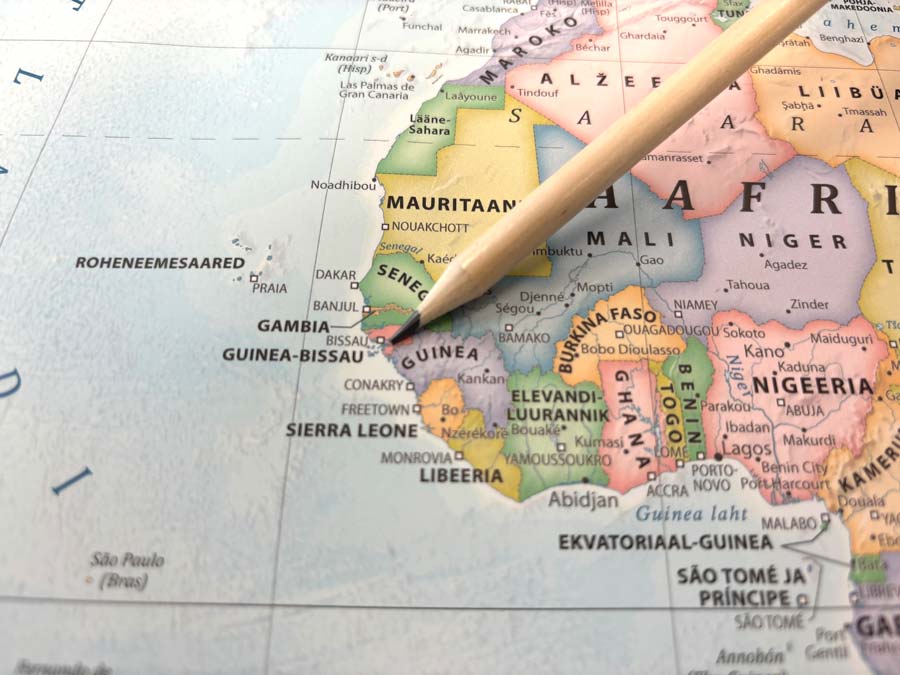
When looking at the world wall map, one might wonder—why are there so many countries with the name Guinea? There’s Guinea and Guinea-Bissau, neighbors on the Atlantic coast of West Africa; Equatorial Guinea, located on the Gulf of Guinea; and Papua New Guinea, all the way on the other side of the world.
There are several theories about this, but the most widely accepted explanation is that the word “Guinea” comes from the Tuareg word “aginaw”, which means “black people.”
Including all the Guineas, our map shows a total of 195 independent countries, as well as the islands and overseas territories belonging to those countries.
The new printed map also features a novel material — it’s thin, lightweight, and durable, and can be easily mounted on a wall using pushpins or adhesive. In addition to the standard map (99 x 65 cm), larger versions are also available for custom order from Regio’s online store. We print maps on paper, rigid boards, blackout roller blinds, and even wallpaper.